color + material
Backgrounds, gradients, shape, corner treatments, shadows, visual materials, and light/dark variants.
community skin directory
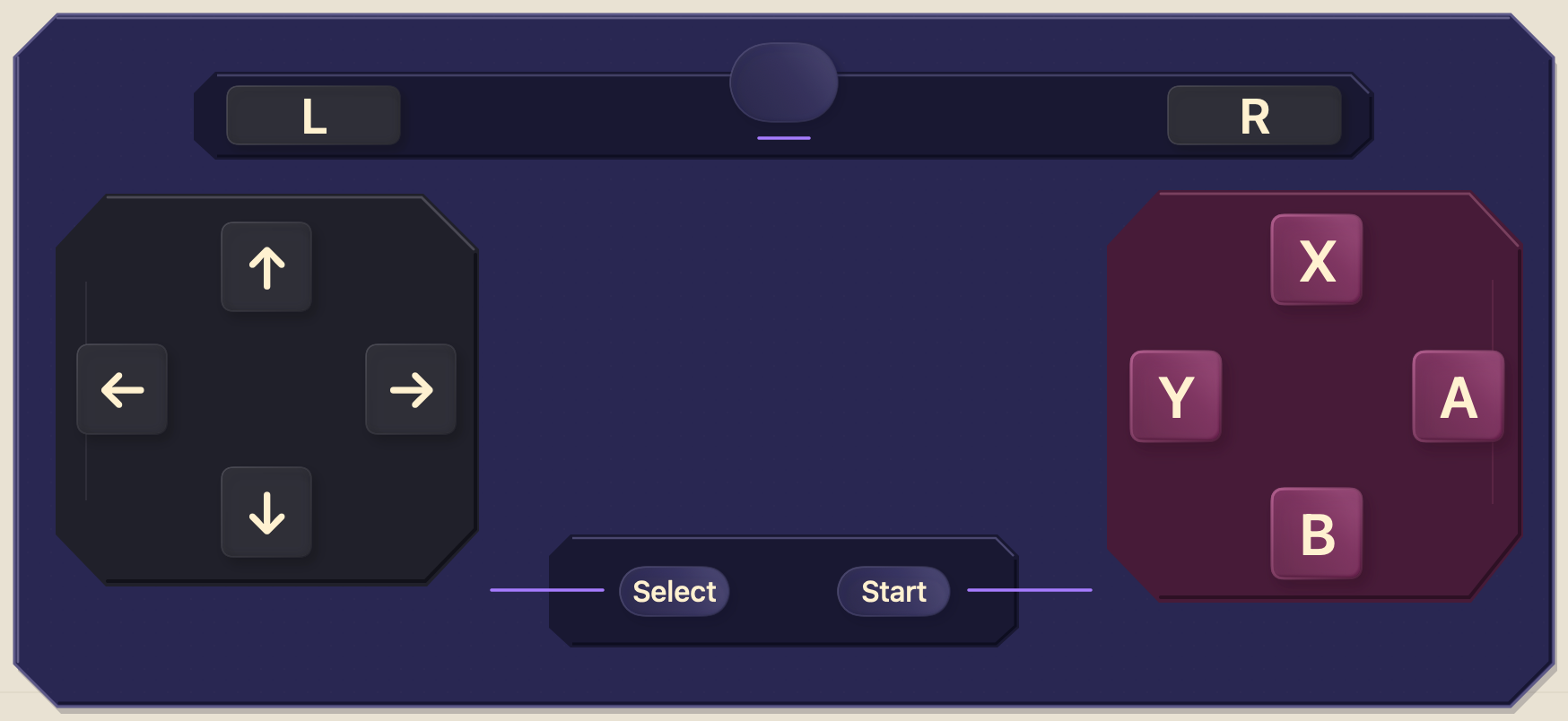
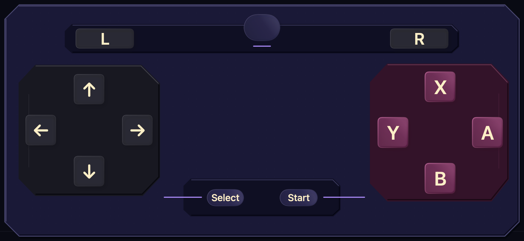
Browse appearance-only themes for Thumble. A skin can change materials, color, icons, and pressed states—but never your layout, keyboard shortcuts, controller bindings, or accessibility.
browse
Every package listed here passes the same validation used by Thumble before installation. Preview it, inspect the creator and license, then open the Share Sheet or download the file.
Loading directory…
safe, portable, reversibleClear the search or publish the skin you were hoping to find.
what a skin can do
Backgrounds, gradients, shape, corner treatments, shadows, visual materials, and light/dark variants.
Visual icons, control-state styling, labels, and safe haptic presentation assigned through semantic roles.
Keyboard shortcuts, pointer actions, controller outputs, launch targets, and executable bindings stay local.
Controls remain native and accessible. Artwork decorates them without taking over hit testing or VoiceOver.
for creators
Scaffold editable JSON and SVG against a canonical artboard, compile it, inspect every native state, then submit the exact package for critique and human approval. The directory checks identity, hashes, compatibility, archive limits, originality, visual quality, and appearance-only boundaries before anything ships.
thumble skin scaffold "My Skin" --identifier com.creator.my-skin -o ./my-skin
thumble skin compile ./my-skin -o ./my-skin/build/MySkin.pocketpad --clean --strict
thumble skin quality ./my-skin --strict
thumble skin preview ./my-skin --all-variants --all-states --contact-sheet -o ./my-skin/reviews/contact-sheet.png